
| Prompt | Model | Status | Created | Result | Actions |
|---|---|---|---|---|---|
No generations yet. | |||||






ByteDance / Seedream 5.5
Seedream 5.5: create, edit, reuse
Refine an image over multiple edits, create transparent assets, and give photographs and lettering a more natural finish.
Seedream 5.5 is available on Kuca
What changes with Seedream 5.5
An image rarely goes straight from the first prompt to the finished design. A client wants a different chair, a warmer wall or a smaller logo area, while the rest of the picture should stay intact. Seedream 5.5 focuses on that kind of controlled revision alongside stronger image quality. Its official release introduces stable multi-turn editing, native RGBA output and improved rendering of realistic surfaces and text.
The official demonstrations include rooms edited through several arrangements, transparent character assets and photographs with natural skin and fabric detail. ByteDance also reports a continuous 100-round editing demonstration with each output used as the next input. That is a vendor demonstration, not a promise that every subject will survive 100 arbitrary changes perfectly. Plan each revision around an observable goal: preserve the perspective, change one object, then inspect the edges, reflections and relationships to neighboring objects.
Edit without starting over
Change a chair, an outfit or a small accessory while keeping the surrounding picture stable. Work on the same composition over successive revisions.
Furniture and decor change while perspective and lighting remain coherent.
Read the details
Seedream 5.5 is ByteDance’s image generation and editing model for sustained creative work. Refine a scene across multiple edits, generate assets with native transparency, and create photographs or illustrated layouts with more natural detail and clearer lettering.
Keep the parts you already like
Choose the editing variant when you already have a photograph or a useful draft. Upload a clear reference, wait for the upload to finish, and describe the change alongside the details to keep. “Change the wall to warm beige and preserve the blue chair” is easier to evaluate than “make this better.” Begin with one source image; add another only when it contributes a distinct subject, lighting direction or visual style.
For repeated edits, describe both the change and the surrounding details that matter. Seedream 5.5 supports pixel-level preservation outside the edited region, according to its release documentation. Still check the result against the previous version rather than assuming every surface stayed untouched. Save useful checkpoints before changing a face, product shape or intricate pattern. The official room sequence is a good example: moving furniture requires coherent perspective, shadows and newly revealed areas as well as a plausible new object.

Create assets with transparency
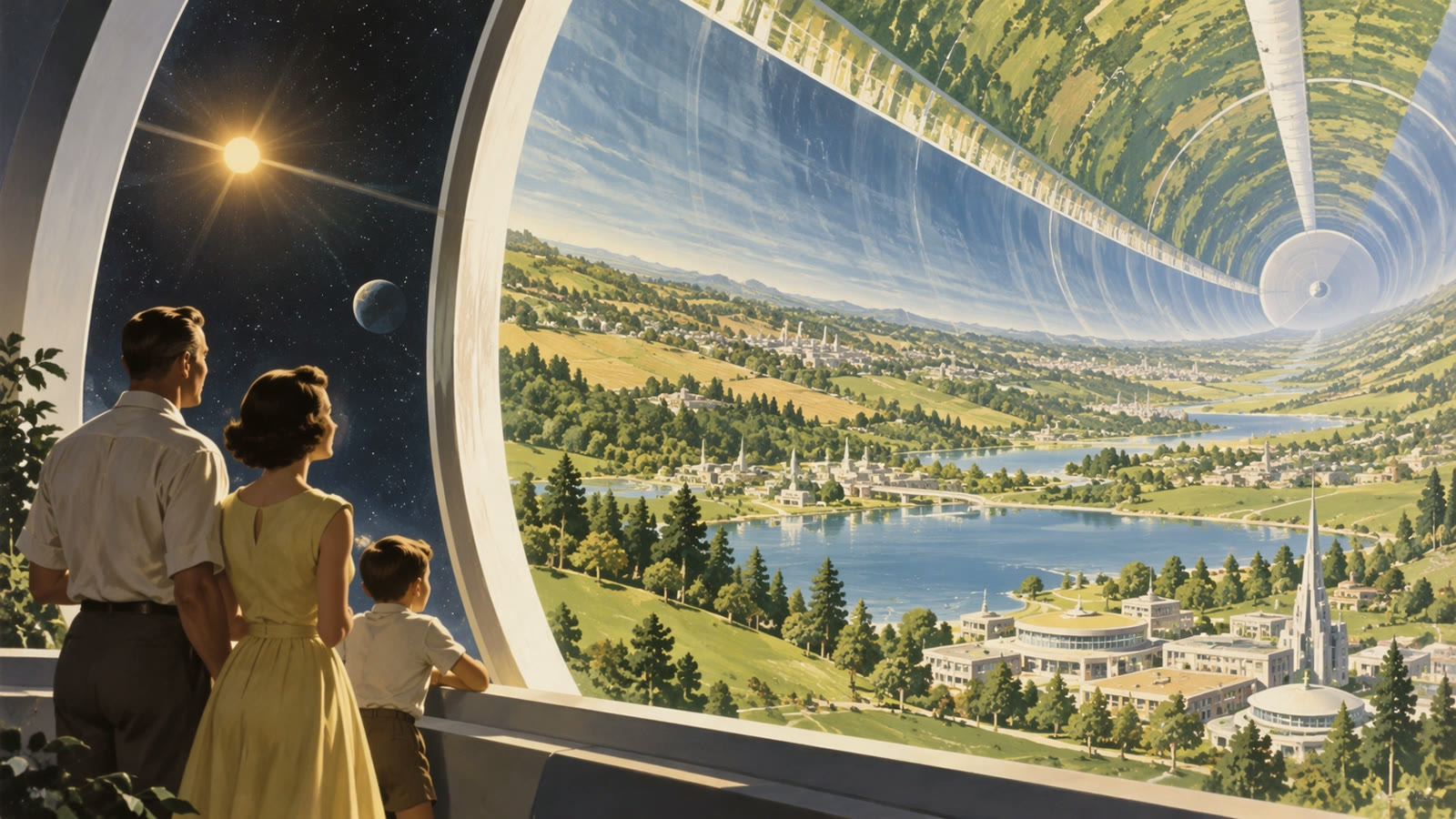
Generate characters, stickers and lettering with native RGBA transparency. Reuse them in a new composition without first cutting away a solid background.
The demonstration shows a subject prepared for reuse in a different composition.
Read the details
Create elements with native transparency
Transparent output is a separate capability from image size. Seedream 5.5 can generate RGBA images with an Alpha channel, including partially transparent areas. That makes cutout characters, stickers, lettering and compositing elements practical starting assets. Ask for the required background transparency explicitly and check the downloaded file in an editor that displays Alpha. A checkerboard baked into a preview is not transparency. Nor does an RGBA image imply a layered PSD, editable vector paths or a complete animation project.
Think about the later crop before generating. Leave room around faces, handles, packaging edges and other important details when a publishing tool may crop again. Use a square for a square card, a vertical frame for a story and a horizontal frame for a banner. A larger file does not fix an awkward composition. Settle the framing first, then use a higher tier when you need more detail for the selected direction.
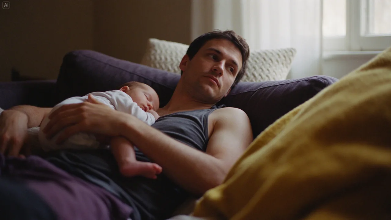
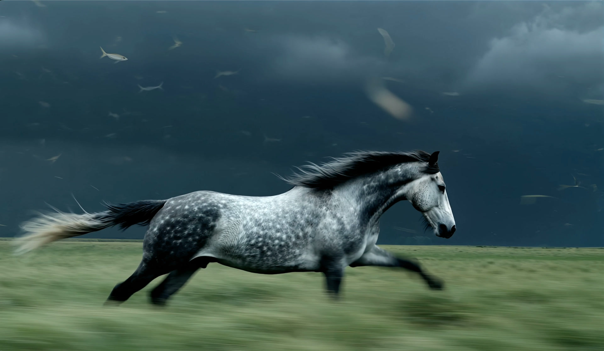
Natural texture. Clearer text.
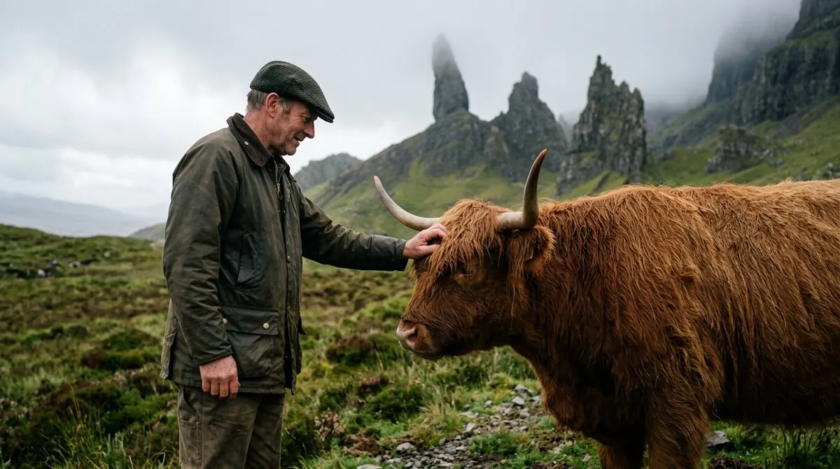
More natural light, skin and fabric, with improved rendering of complex characters and small lettering. Inspect the details at the size you plan to publish.
A photographic example with soft shadows and visible fabric texture.
Read the details
Put words in the image with a clear hierarchy
The official release also highlights more natural lighting, skin and fabric, with less excessive shine and overexposure. Dense small lettering and complex characters are another focus. These improvements make poster and infographic drafts more useful, but they do not remove the need to proofread names, prices and every required character.
When a design needs lettering, give the exact wording in quotation marks and describe its position. Keep the headline short enough to read and leave a quiet background behind it. Review every letter, accent, number and punctuation mark at full size. If the visual is intended for several languages, prepare the wording separately for each audience and check whether the line breaks still work in the chosen layout.
For prices, legal text or approved brand copy, adding the final typography in your design editor gives you direct control over spelling and spacing. Generate the visual base with room for those elements, then place the approved text afterward. This is also practical when the wording may change at the last minute. Keep the original image and the final design as separate files so you can update the copy without generating the whole scene again.
Plan the image before the first draft
Start with the use, then make one change at a time.
Plan the frame
Choose the subject, crop and space for any headline before refining small details.
Develop one direction
Keep a useful first image, then vary the setting or color without changing the whole brief.
Check before submitting
Review the selected model, credit estimate and visibility. Save the prompt with the result.
Read the details
Describe the image you actually need
Begin with a subject and a destination. A picture for a product card needs a different crop from a wide website header or a vertical social post. Describe the object, its material, the lighting and where it should sit in the frame. If you plan to add a headline later, ask for clean space on the appropriate side rather than filling the entire picture with decorative elements.
For example, a ceramic bowl on pale linen in soft morning light gives the model a clearer brief than a string of words such as beautiful, premium and impressive. Add only the details that affect the visible result. Choose the aspect ratio in the form as well: writing “wide” in a prompt does not replace the ratio setting. Once the first image appears, decide whether the composition works before chasing tiny details.
Build campaign visuals in manageable steps
For a product campaign, start with one hero image. Name the material, the surface under the object and the light that creates its reflections. Keep the background simple enough to judge whether the object is readable. After choosing a direction, make controlled variations in color or setting while keeping the same subject description. Comparing three deliberately different treatments is more useful than generating many almost identical pictures without a selection criterion.
For an editorial illustration, decide what the viewer should notice first. A single gesture, a recognizable silhouette or an empty place at a table can carry the idea. Avoid asking one image to explain an entire story. Save the version that communicates well before trying a more elaborate scene. You can then use a finished still as the starting point for an image-to-video project without rebuilding the visual concept from scratch.
Review credits, visibility and your source material
Credit cost depends on the model actually selected in the workspace and the supported request settings. Check its displayed estimate before submitting; the price or reference limits of 5.0 Pro should not be presented as 5.5 specifications. Keep account visibility in mind when preparing product references or personal portraits. For a useful test, change one creative requirement at a time and save the successful prompt with the output, so a later revision has a clear starting point.
Check the public or private setting before using personal photos or unreleased product material. Private generation requires paid access under Kuca’s account rules. Use references that you own or have permission to process. When the result is ready, inspect it at full size, download the working candidate and check the download options shown for your account. Keep the prompt with the image so a later revision starts from a known version.
Compare 5.5 and 5.0 Pro on the same brief
Read the official releaseA useful comparison starts with a small set of real tasks: a product scene, an image edit, a portrait composition and a layout with a short headline. Save the prompt, references, ratio, quality choice and output from today’s model. Choose a few visible criteria before comparing, such as whether the label is readable, whether the object keeps its shape and whether the requested empty space is present.
ByteDance’s published comparison against Seedream 5.0 Pro covers ecommerce, marketing, film, games, office work and fashion. It reports improvements in both usability and subjective quality, with usability more than doubling in its film and office tasks. Those are vendor test results, not a forecast for every project. Run your own matched briefs and look at how much correction each result needs. Also distinguish this release from Seedream 5.5 Pro: the announcement describes Pro as a later addition, not the version demonstrated here.
Questions about Seedream 5.5
Yes. ByteDance has released Seedream 5.5, and you can use it on Kuca for text-to-image generation and image editing. Choose 1K, 1.5K or 2K output. For a transparent background, use PNG; editing accepts up to 10 reference images.
ByteDance demonstrates successive edits using each result as the next input. It illustrates stability over a long editing session; it is not a guarantee for every prompt or scene. Save checkpoints and compare each revision.
No. Native RGBA output includes an Alpha channel for transparent and semitransparent areas. A layered PSD or editable vector file is a different format and is not established by that capability.
No. The release is Seedream 5.5. ByteDance says a Pro version will follow; do not apply 5.0 Pro pricing, controls or reference limits to this model.
Check the visibility control before submitting. Private generation is available with paid access; the options shown in the workspace apply to your account.
Read the task status and error first. Check your references and required fields, then retry once the previous task has finished. Avoid duplicate submissions while it is processing.